CONCEPT
Making news better - together
People love to talk their passion. We wanted to provide a platform where they could discuss – in depth – topics they love. We wanted to offer several posting posting options and motivate engagement using a specially designed gamification system, earning users Reputation points and badges for participation and peer feedback.
Design Goals and solutions
The challenge
Choose what new features go into the community design.
Design accessory features needed to support the new ones.
Design at scale while preserving uniqueness for our diverse crowds.
Design to allow for growth or network effect.
Design and solutions
Newsfusion community features
Working with very tight resources, we couldn’t enrich the community with all the ideas we had like quizzes, uploading images, or even linking to all video platforms. Eventually we decided on the following:
Community features
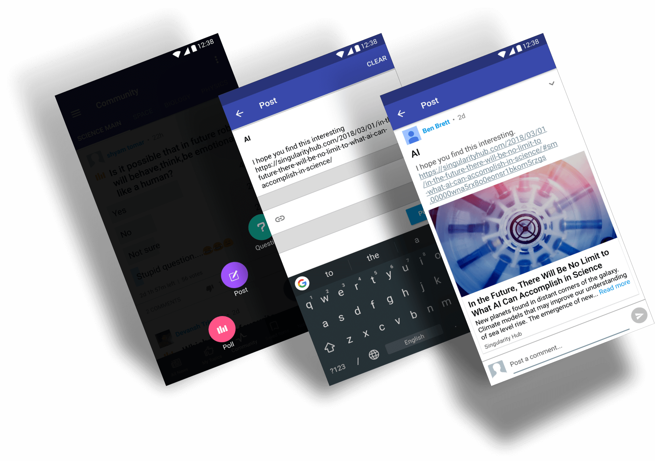
- Regular post.
- Linking to Youtube videos.
- Linking to external URLs.
- Creating polls.
- Viewing sub-verticals.
Supporting features
- Personal profile.
- Gamification system.
- Follow other users.
- Cross-vertical ID.
- Article tagging system.
Focus on what matters: Scroll up for major updates and down for other news.
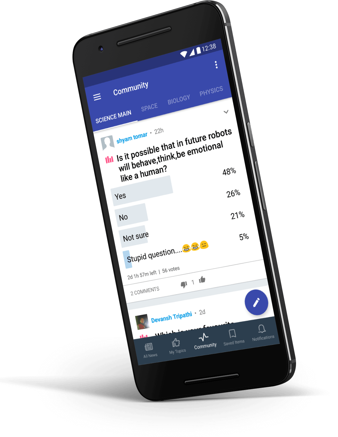
Create engaging polls (by far, our most popular feature).
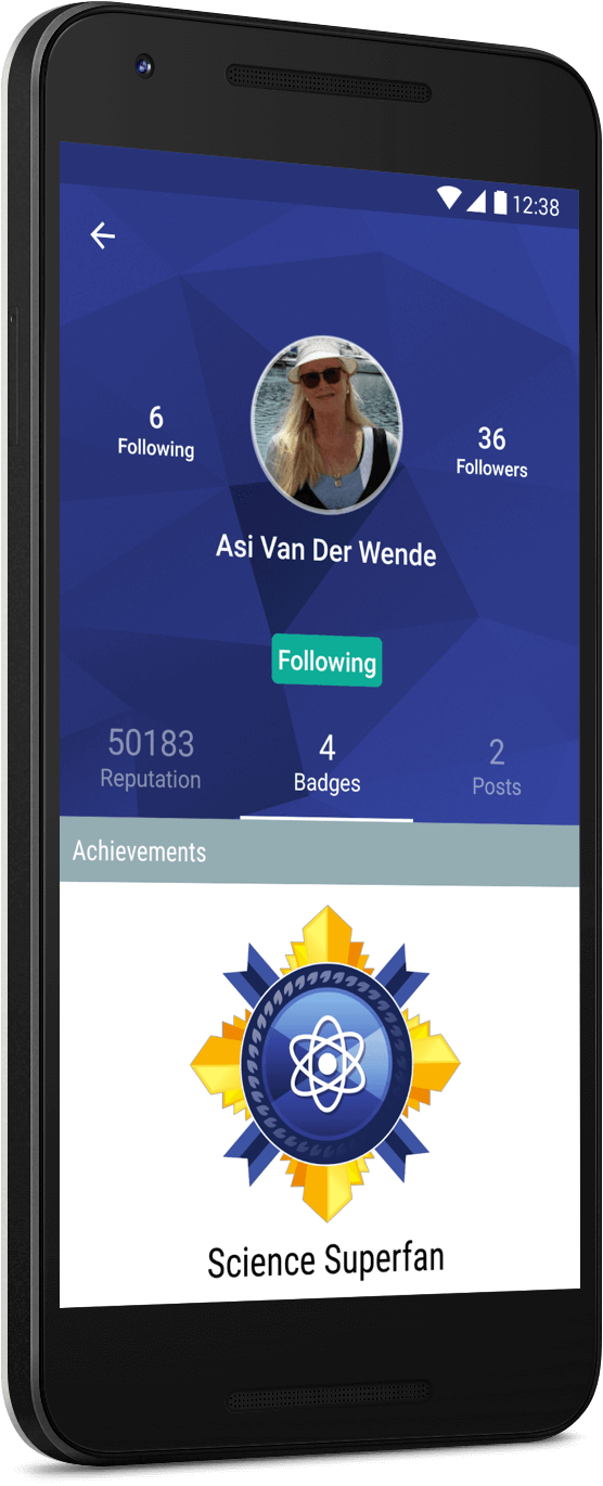
A personal profile which displays users’ stats and posts
Via the profile, any user could see the progress of their peers, the posts they’ve published and follow them to get notified when they’ve posted again.
Reputation points & badges system
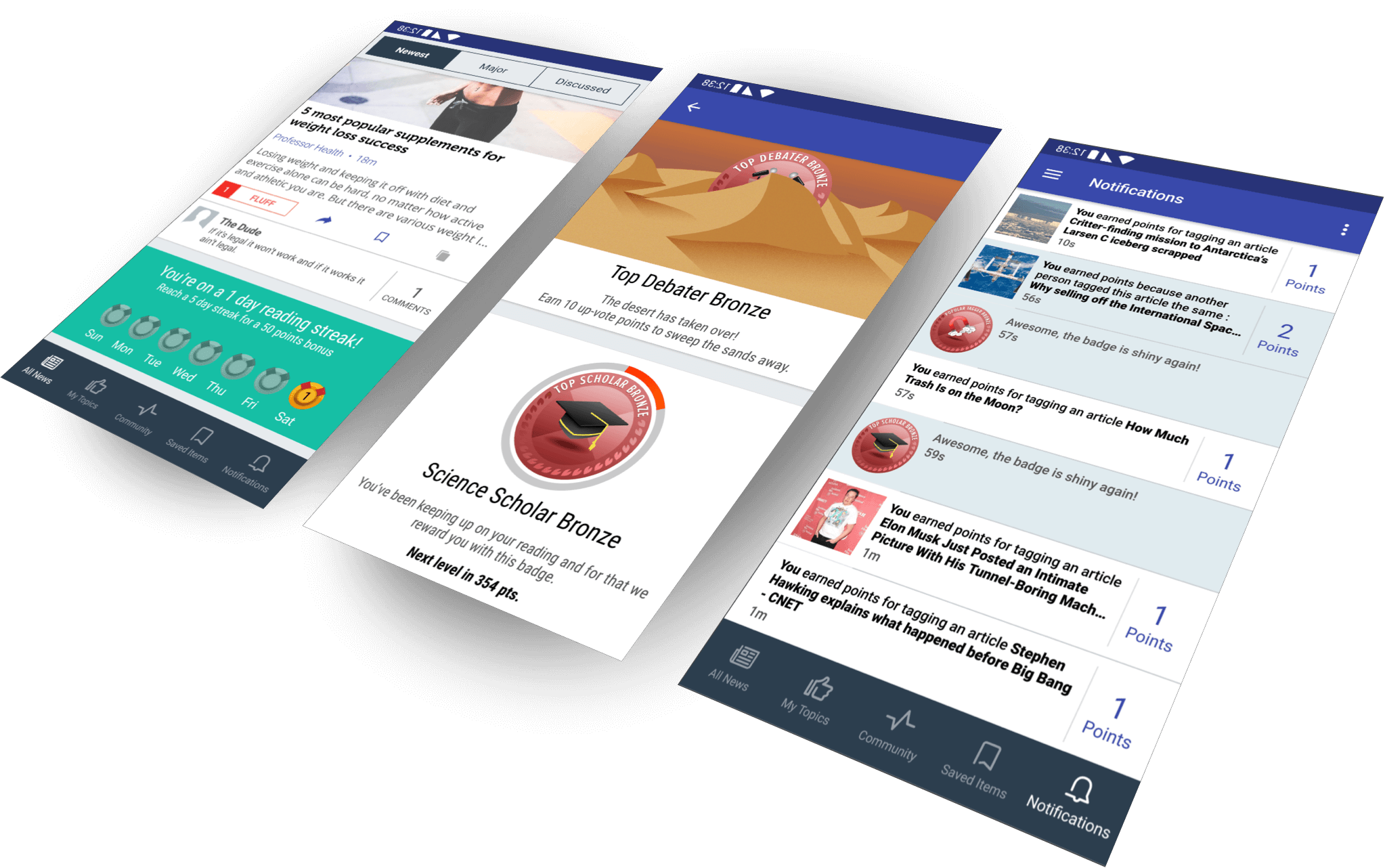
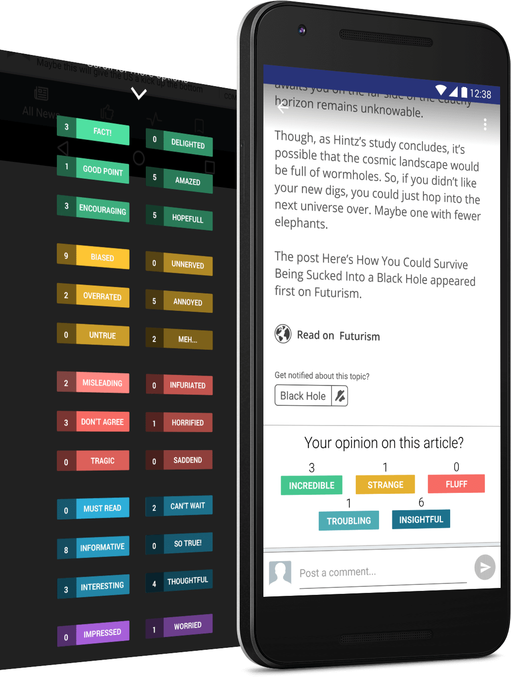
Article tagging system, a popular, yet divisive feature.
Though a popular feature, many users requested more tagging options, which we actually designed, but was sadly not implemented.
Mini app icons display the app users comment from.
Designed as a growth feature, we wanted users who comment on the same articles from different apps to know these apps exist.
Design diversity at scale
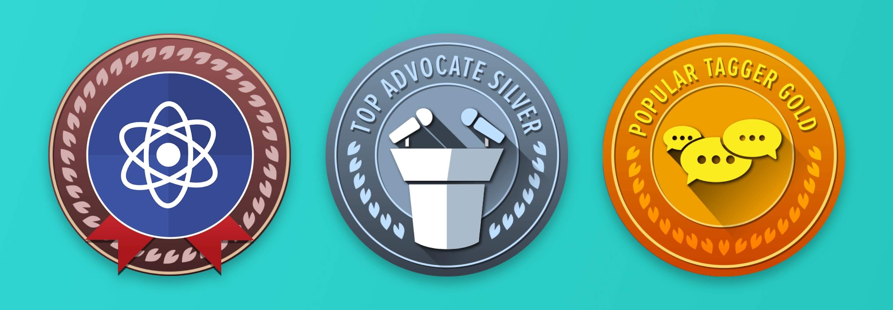
Examples for badges in a few of our apps. The top group is our default design for our small, generic news apps.
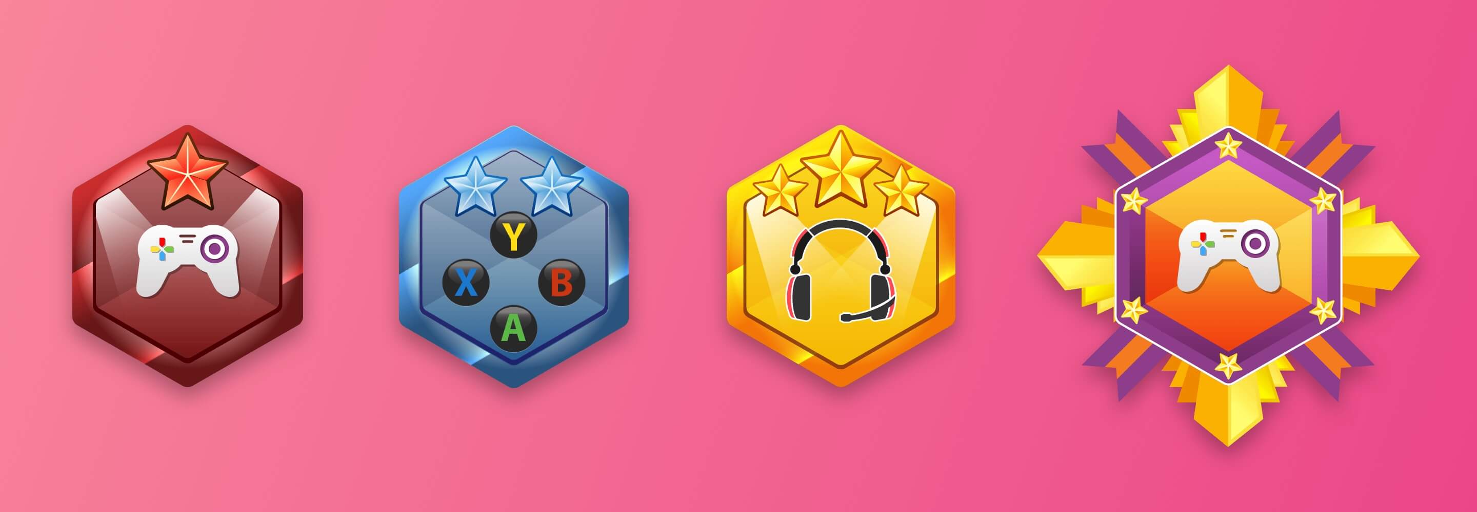
Some apps, like Gaming news, Xbox and PlayStation news needed special icons that fit the crowds more.
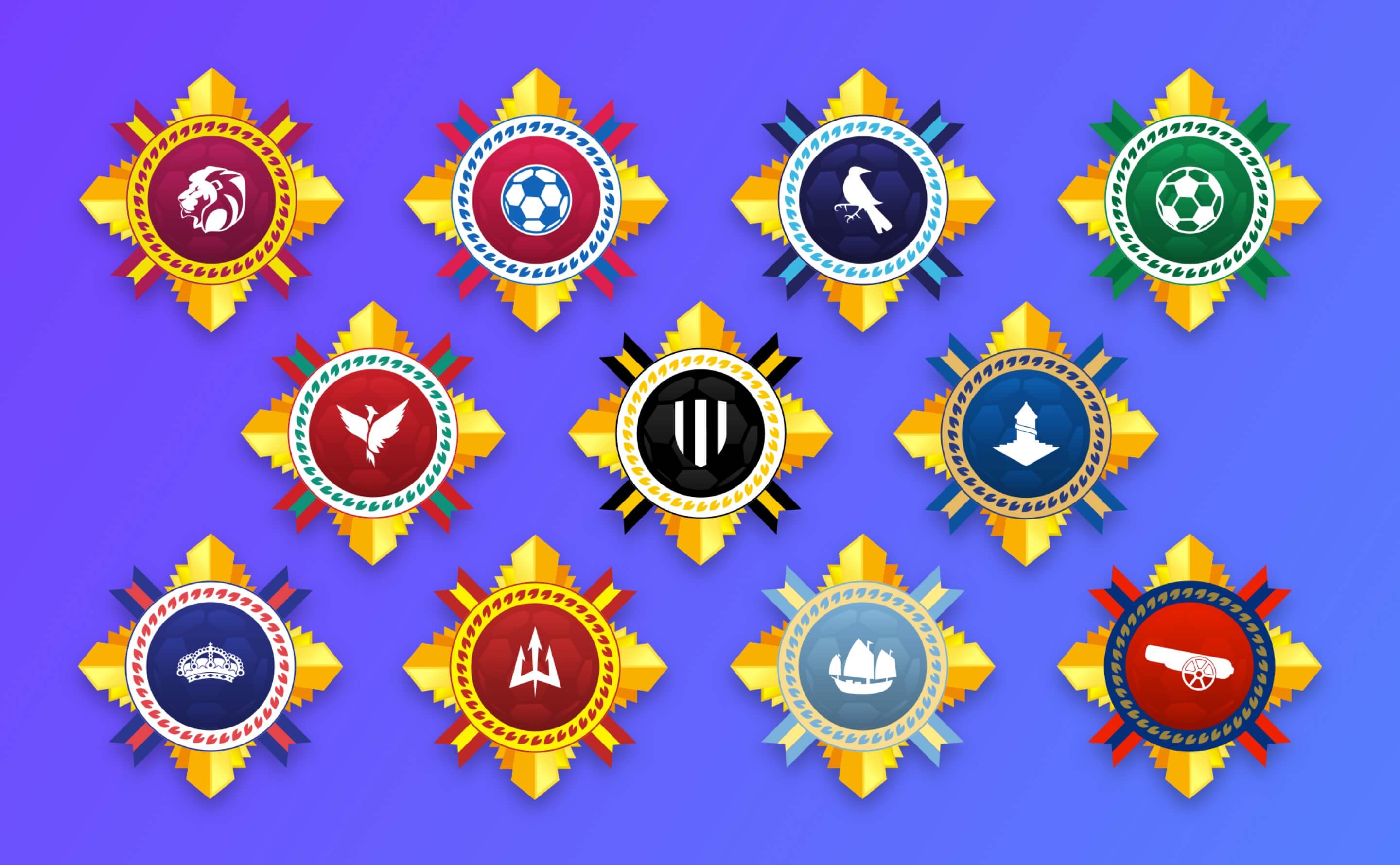
Special care was needed for sports teams as team colors are important to the fans. Here are some examples for the soccer premiere apps.
I can proudly say that our community features (and other minor yet valuable UX tweaks) have improved app open-rates by up to 85% and, in our top 30 apps, have improved engagement by 200%.
Science News alone has quadrupled organic downloads in only one quarter.