02 — Push · iOS News App UX Case Study

    Push: an iOS news app designed for the busy.

    Push was designed as a utility app that enables highly busy people to receive pertinent headlines on topics they are passionate about.

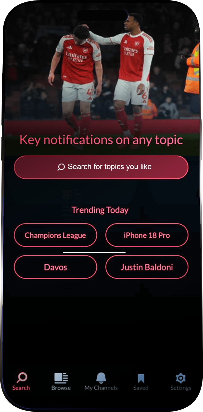
    Push iOS news app screens showing a topic-based headline feed on a phone mockup
    Company
    Newsfusion
    Duration
    3 months to MVP
    Role
    Lead Product Designer (solo)
    Team
    CEO · Developer · Me

    My contribution

    Sole product designer, concept to App Store.

    I owned the product design end to end: concept, information architecture, the dual-direction feed interaction, the visual system, and the Slack bot and newsletter extensions. I worked directly with the CEO and a single developer, shipping an MVP in three months without a research budget. The same solo, constraint-driven approach runs through my Affogata and News Fusion case studies.

    The brief

    Design and ship a news application that beats noise with signal — for highly busy people who can't afford to scroll.

    01

    The Problem

    Highly busy individuals spend significant time early mornings or late nights scouring news feeds, websites, and newsletters for valuable information. Existing news readers like Nuzzle, Flipboard, Google Now, and AP Mobile require excessive attention to find relevant headlines, delivering quantity over quality.

    02

    The challenge

    Design and ship a news application with significant constraints:

    • No time for formal user research
    • No resources for user testing
    • Extremely lean team (designer + CEO/developer)
    • 3-month timeline to create a market-ready MVP

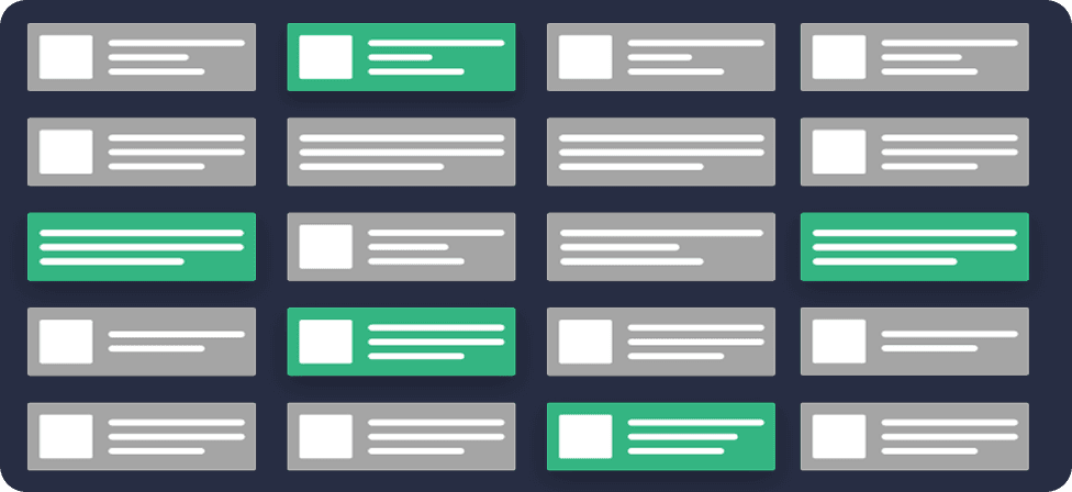
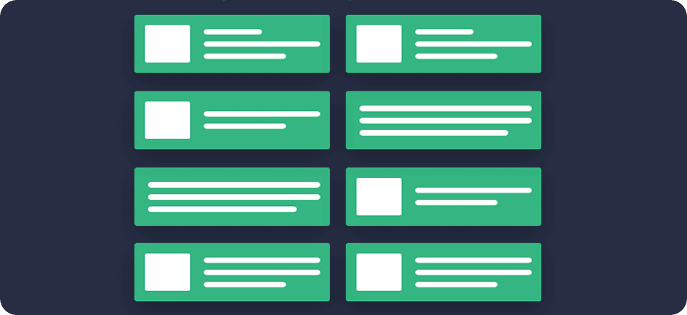
    Noise vs. signal

    Regular news feed showing scattered valuable content

    In most news readers valuable headlines are few and far between

    Push news feed showing only relevant headlines

    Push only notifies on pertinent headlines users have specified

    Design Approach

    Three core principles, applied without compromise.

    To differentiate Push from competitors, we focused on three core principles:

    01

    Quality Over Quantity

    Curate and surface only the most important headlines, reducing information overload.

    02

    Intelligent Prioritization

    Separate major headlines from lesser important news with innovative UI patterns.

    03

    Reduced Social Dependency

    Less reliance on social media curation, focusing on algorithmic intelligence.

    Working in constant collaboration with the CEO/developer, I designed the complete UX and visual design for the MVP, making rapid decisions to meet our aggressive timeline while maintaining design quality.

    Decisions

    Key Features & Design Decisions.

    01

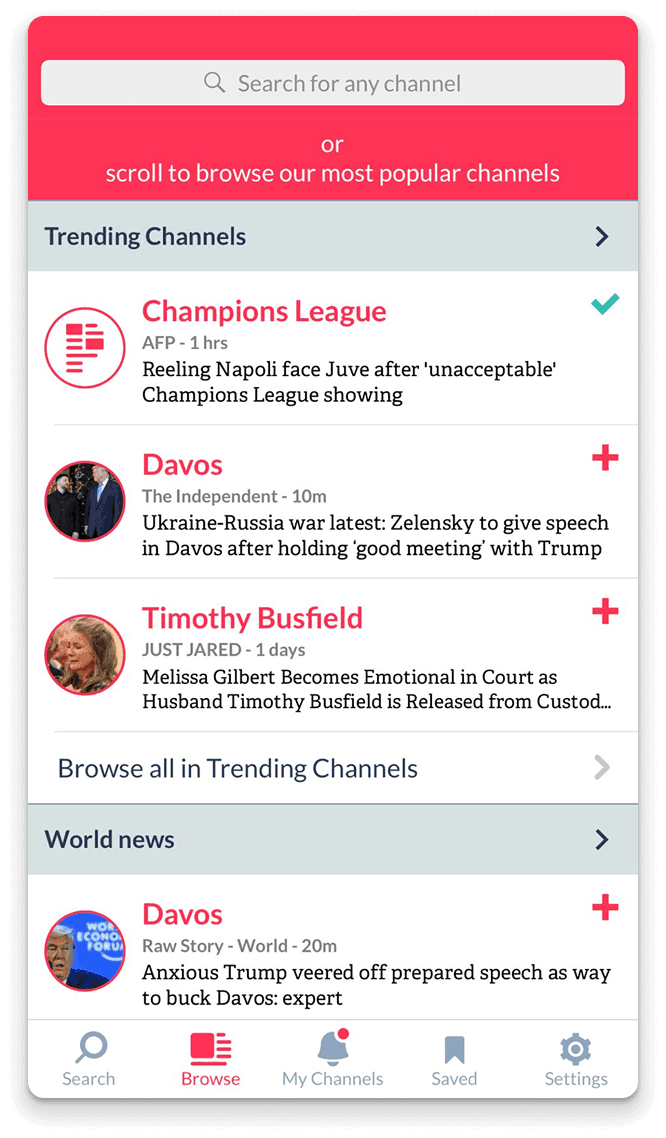
    Home Screen: Trending Topics at a Glance

    Design Rationale
    We wanted users to instantly understand what Push does differently – delivering focused, curated content. Rather than overwhelming with dozens of stories, we present what matters most, right now.
    Trade-off
    This decision was heavily debated, as it went against the conventional news app pattern of showing an endless feed. However, we believed constraint creates focus, and our testing proved this approach resonated with busy professionals.
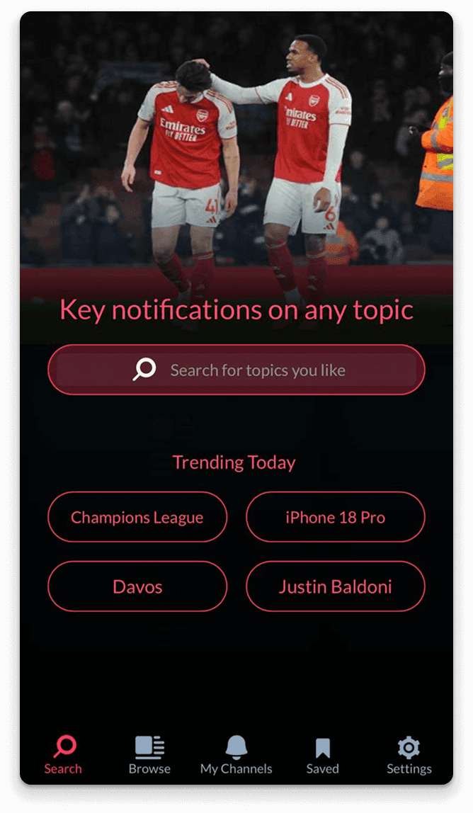
    Push app home screen showing trending topics
    02

    Browse: Discover New Channels

    Move
    The Browse tab let users discover channels across categories – from technology and sports to entertainment and business.
    Design Rationale
    Rather than requiring users to search for specific topics, we organized channels into intuitive categories. This reduced friction for new users who might not know exactly what they wanted to follow, while still supporting direct search for power users.
    Push app browse screen showing channel categories
    03

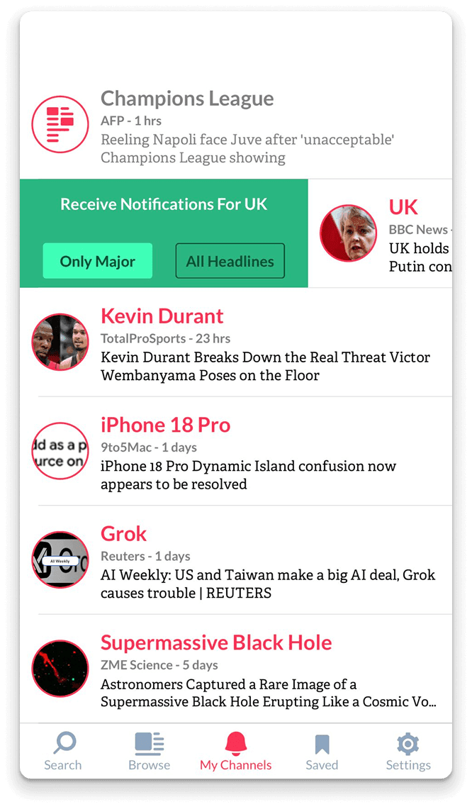
    Smart Notifications: Major vs. All Headlines

    Default
    By default, followed channels only generated "major" notifications – those deemed most important by our algorithm. This prevented notification fatigue while ensuring users never missed critical news.
    User Controls
    • Switch between "Major" and "All Headlines" per channel
    • Unfollow channels instantly
    • Mute notifications temporarily
    • Mark all notifications as read in one tap
    Why it worked
    This granular control empowered users to customize their experience without overwhelming them with settings. The default "major only" setting aligned with our quality-over-quantity philosophy.
    Push app notifications settings screen
    04

    Dual-Direction Feed: A Novel Interaction Pattern

    Bet
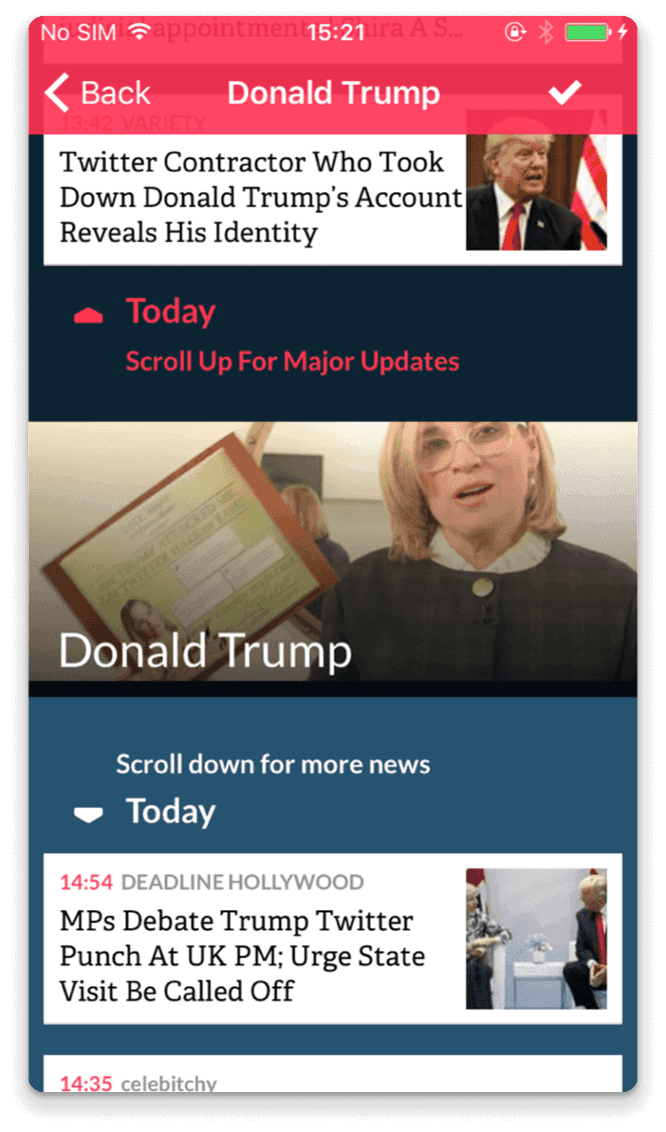
    This was the feature I invested the most design effort into – a unique feed interaction that I'm not aware of any other news app implementing.
    How It Worked
    ↑ Scroll Up

    Access major headlines – the most important, breaking news

    ↓ Scroll Down

    Browse other news – valuable but less urgent stories

    Design Innovation
    This spatial metaphor leveraged the natural affordance of vertical scrolling while creating two distinct content zones within a single feed. Users could quickly scan major news by scrolling up, then dive deeper into related stories by scrolling down.
    Why it worked
    The interaction pattern was discoverable through subtle visual cues and felt intuitive once learned, solving the challenge of presenting prioritized content without creating separate tabs or views.
    Push app dual-direction feed interface
    05

    Supporting Features

    Detail

    My Channels

    A personalized hub showing all topics the user follows, providing quick access to their curated news sources.

    Saved Articles

    Users could bookmark articles for later reading, creating their personal news archive.

    Settings

    Comprehensive controls for customizing the app experience, notification preferences, and account management.

    Beyond the Mobile App

    Where teams already collaborate.

    After extensive discussion, we designed the home screen to immediately showcase the app's core value proposition. Users are greeted with the 4 most trending topics of the day plus a prominent search bar.

    Slack Bot Integration

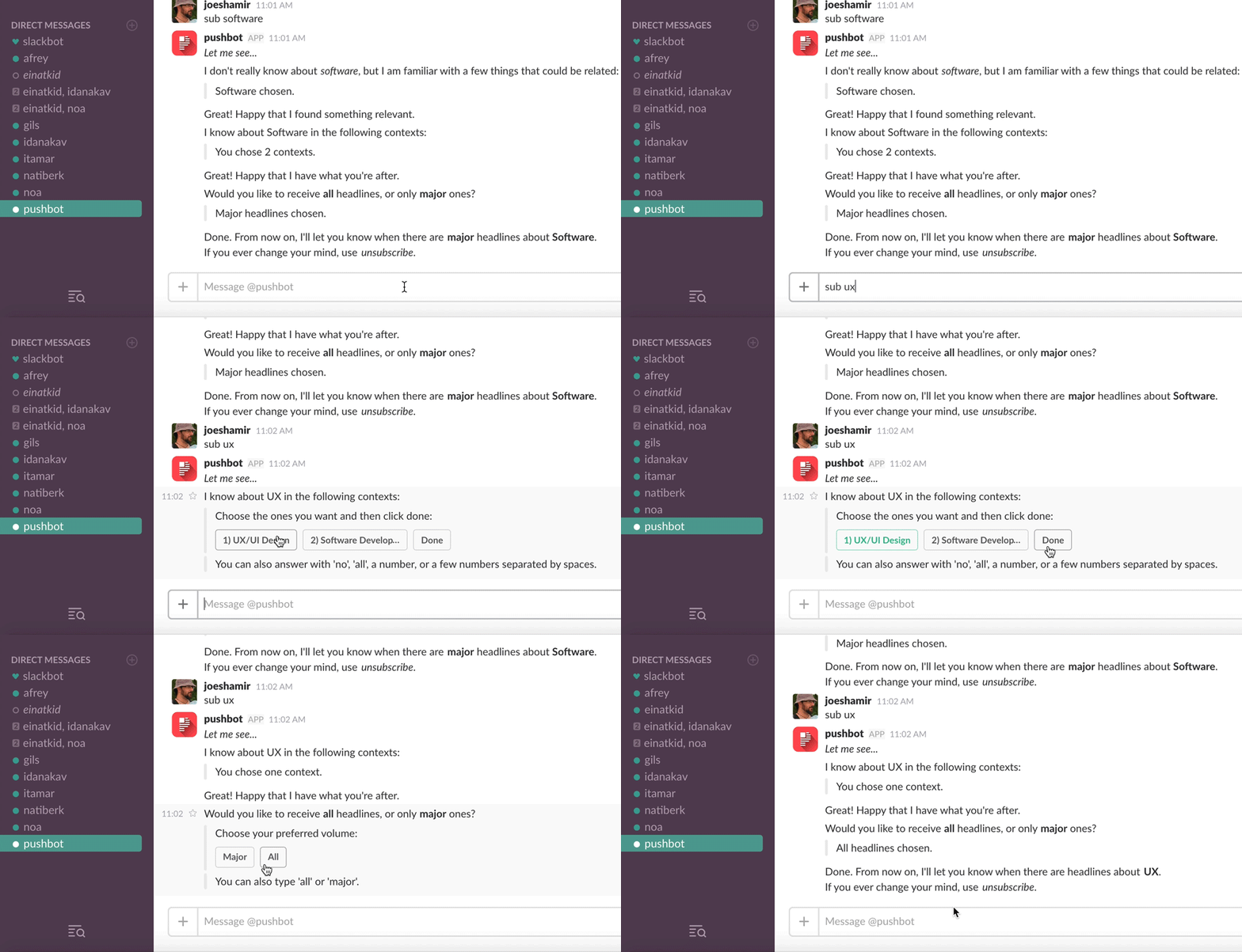
    We extended Push's intelligence to where teams already collaborate. The Slack bot delivered curated news directly into team channels, becoming surprisingly popular.

    Featured twice on the Slack Bot Store, validating our approach to intelligent news curation in a professional context.

    Daily Newsletter

    We designed a complementary newsletter that sent daily major updates for selected topics, allowing users to stay informed even when away from the app.

    This multi-channel approach ensured users could consume news in their preferred format and context.

    Pushbot Slack integration demonstration showing topic subscription conversation

    Key Achievements

    Three months. Two people.
    One award-winning app.

    01

    Designed and shipped a complete MVP within an aggressive 3-month timeline

    02

    Created an innovative dual-direction feed interaction pattern unique in the news app space

    03

    Successfully launched across multiple platforms (iOS app, Slack bot, newsletter)

    04

    App remains available on the App Store, demonstrating sustained value

    05

    Slack bot gained recognition with dual features on the Slack Bot Store

    Lessons Learned

    What shipping fast on a two-person team taught me.

    1

    Constraints Drive Creativity

    Working without formal research or testing resources forced me to rely on first principles and rapid iteration with the developer. This constraint actually sharpened our focus and led to innovative solutions like the dual-direction feed.

    2

    Strong Opinions, Loosely Held

    The heavily debated home screen decision taught me the value of having conviction while remaining open to iteration. We made bold choices quickly, then validated them through implementation and early feedback.

    3

    Multi-Channel Thinking

    Extending Push beyond the mobile app to Slack and email proved that good design principles translate across platforms. The core value proposition—quality over quantity—resonated regardless of the interface.

    4

    Innovation in Familiar Patterns

    The dual-direction feed showed that you can innovate within established interaction paradigms. By building on familiar scrolling behavior, we created something novel that still felt intuitive.

    Personal Reflection

    Push represents one of the most challenging and rewarding projects of my career.

    As the sole designer on a two-person team, I wore many hats—UX designer, visual designer, interaction designer, and product strategist.

    The project taught me that great design doesn't always require extensive research budgets or large teams. Sometimes, clear thinking, strong collaboration, and a willingness to take calculated risks can yield innovative results.

    While I didn't have detailed metrics on user reception, the fact that the app remains in the store and the Slack bot gained recognition suggests we successfully delivered value. More importantly, I'm proud of creating an interaction pattern—the dual-direction feed—that I believe advanced the conversation around how we consume prioritized content.

    Interested in working together?

    Let's discuss how I can help bring your next project to life.

    © All rights reserved to Jonathan Shamir 2025